L.L.Bean
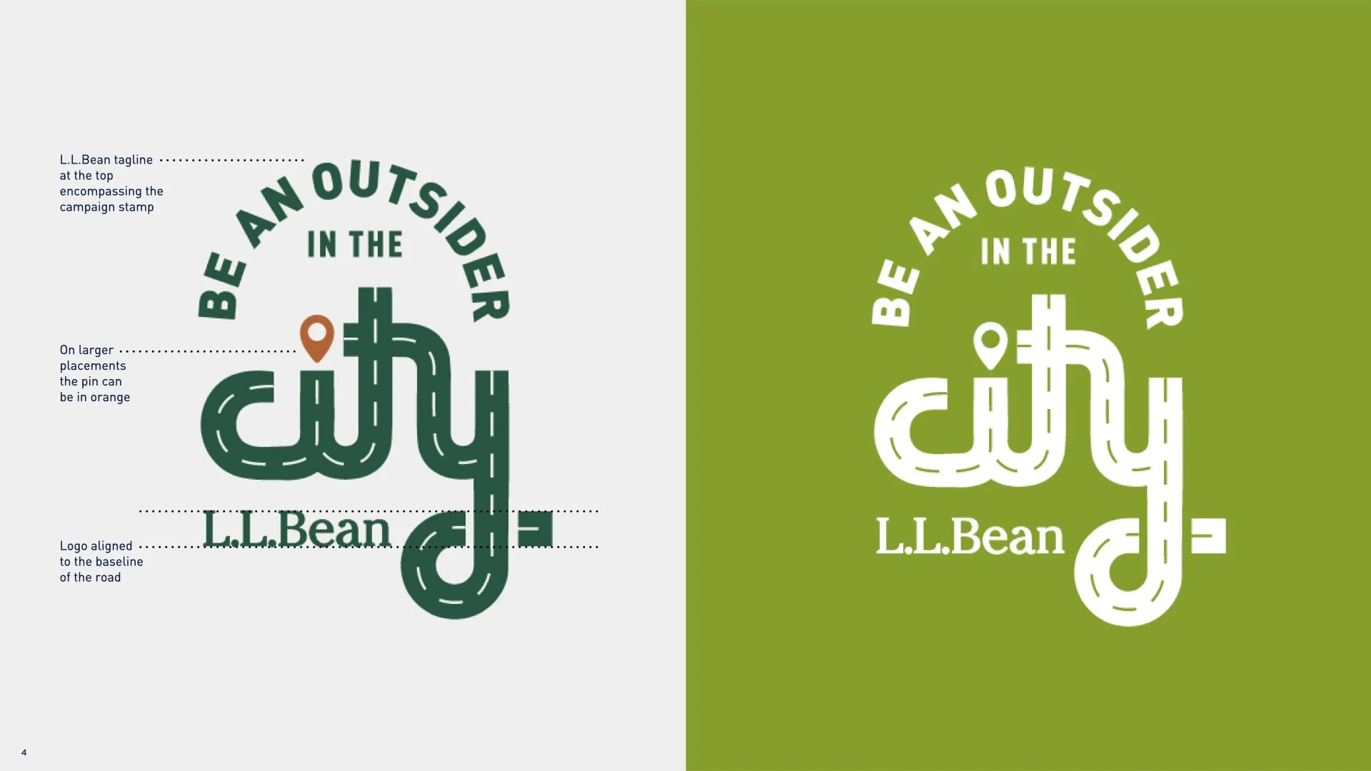
Be An Outsider in the City
L.L.Bean - famous for their cold-weather shoes and parkas - sees sales dip every summer as they lose their clear niche. After all, what “outside wear” do the 80% of Americans who live in urban areas need during the summertime?
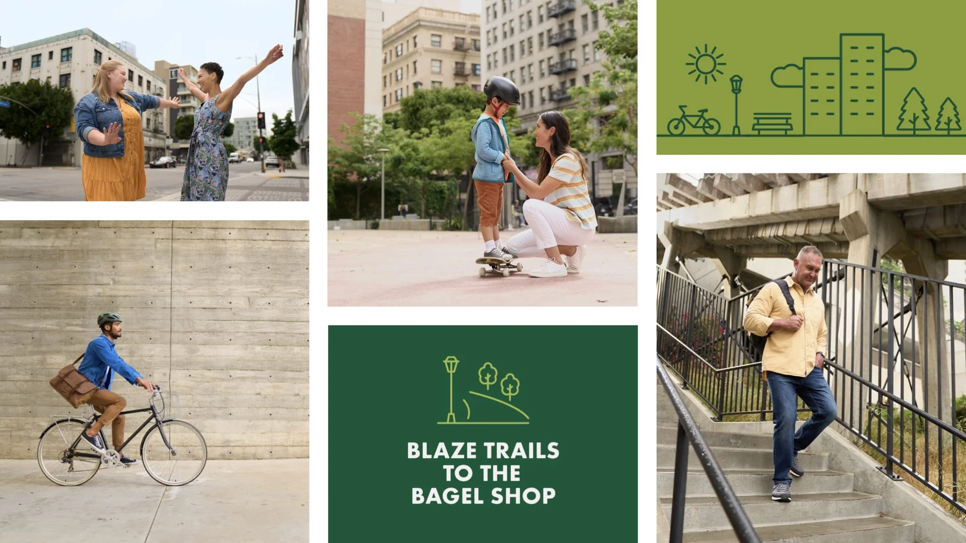
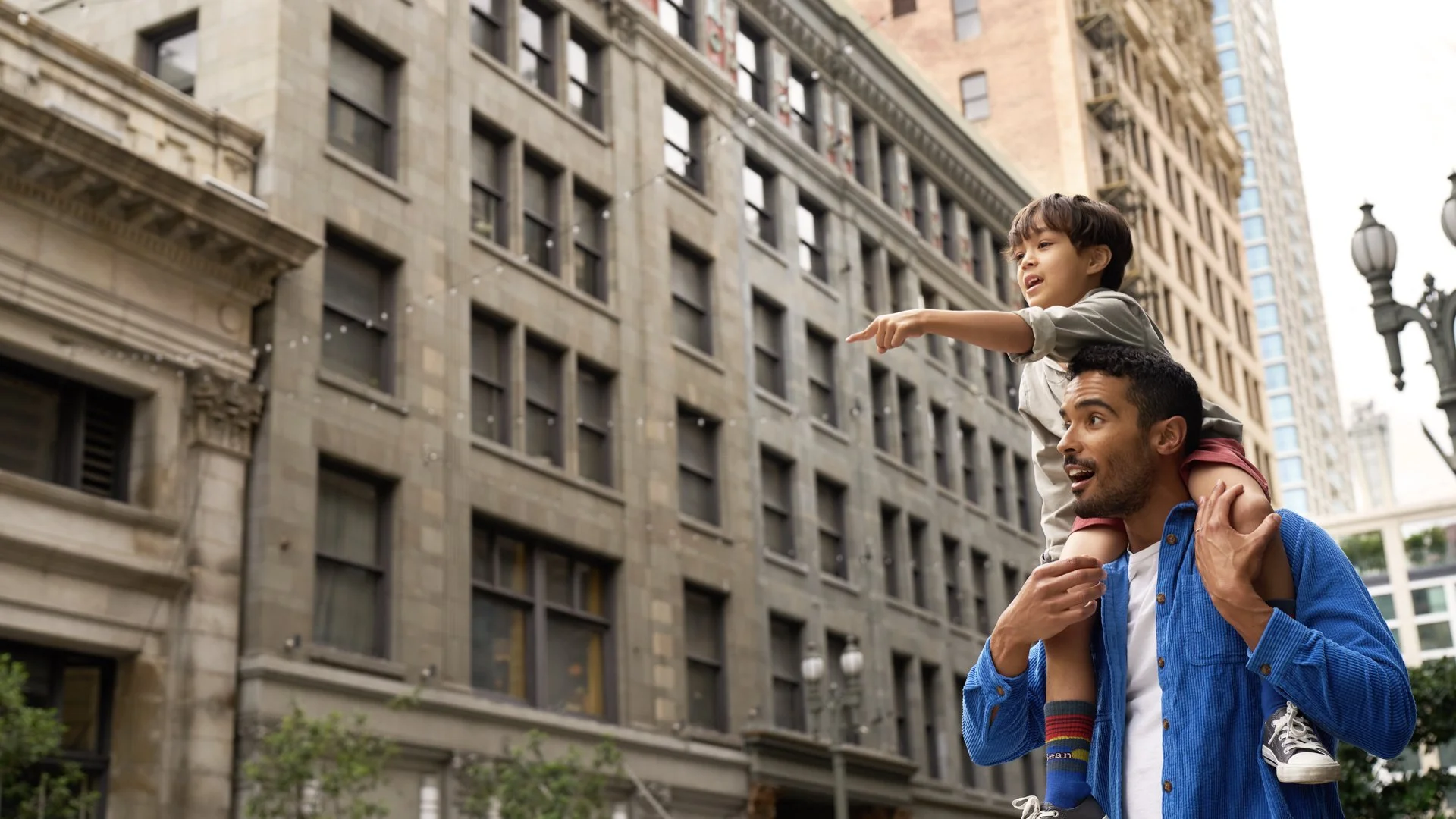
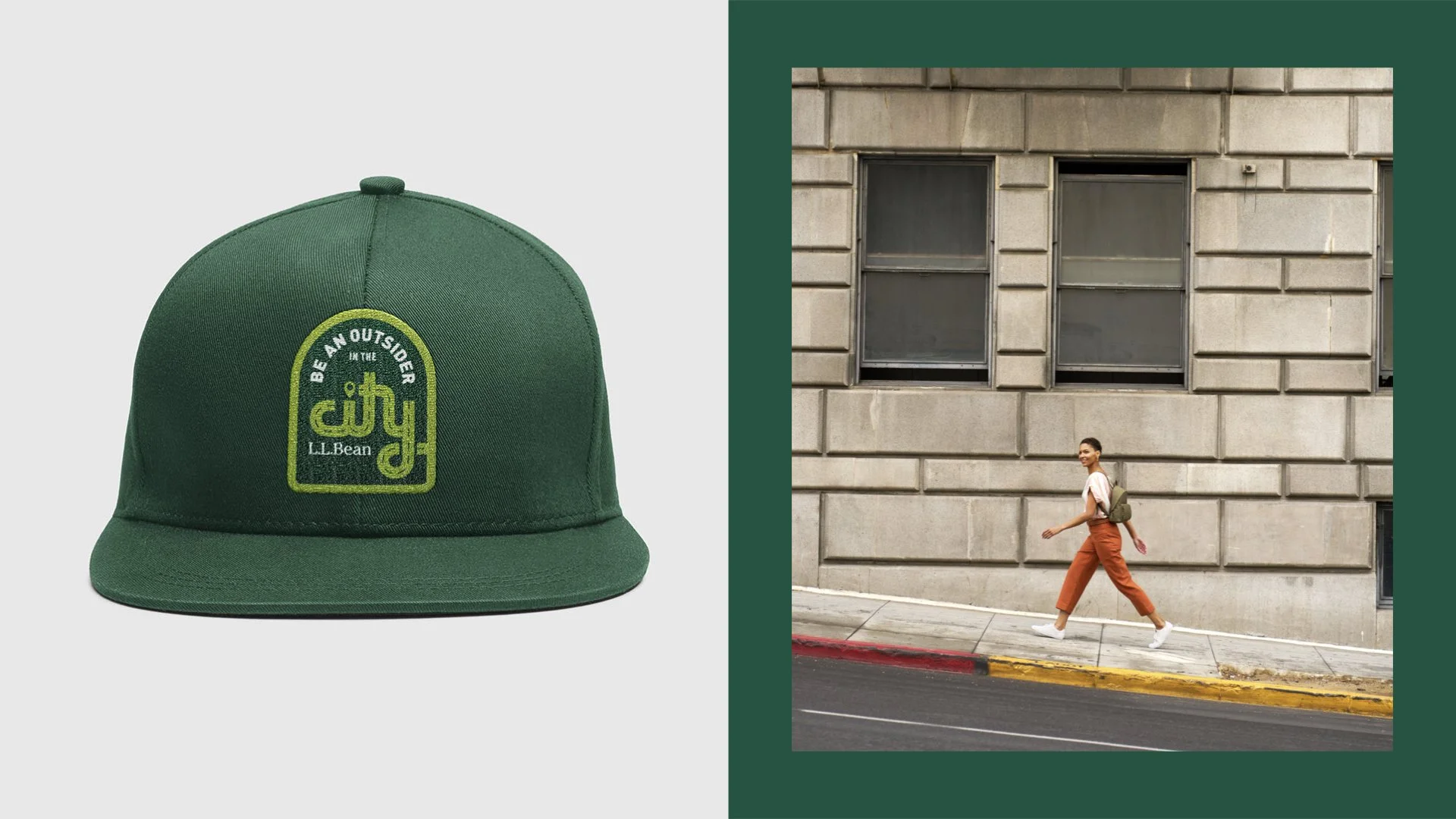
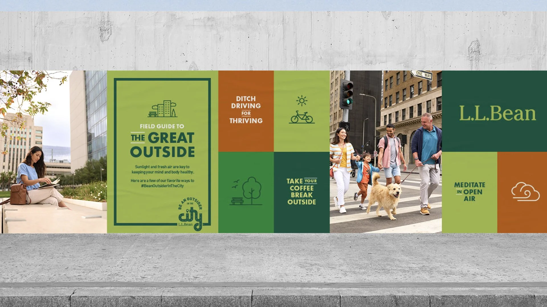
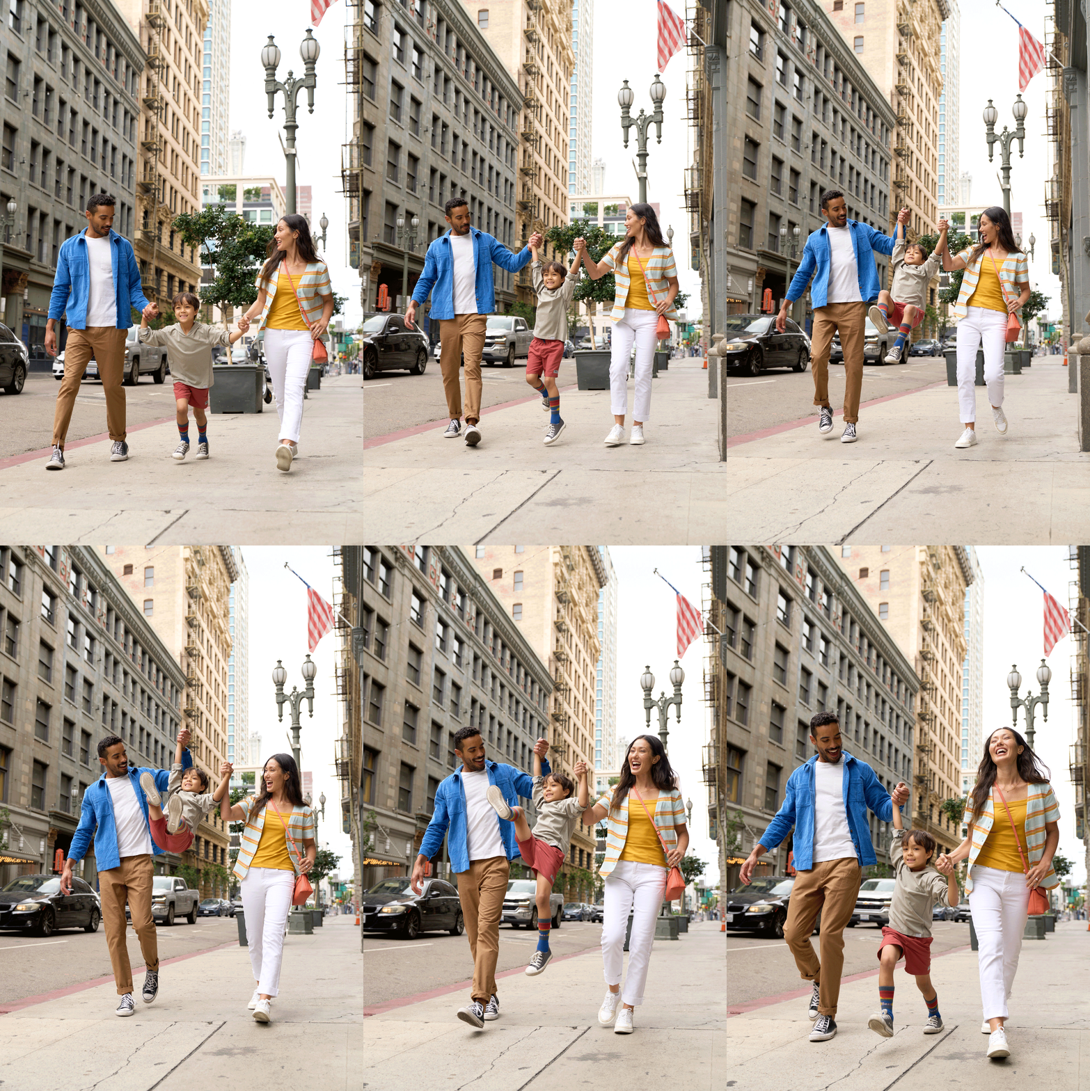
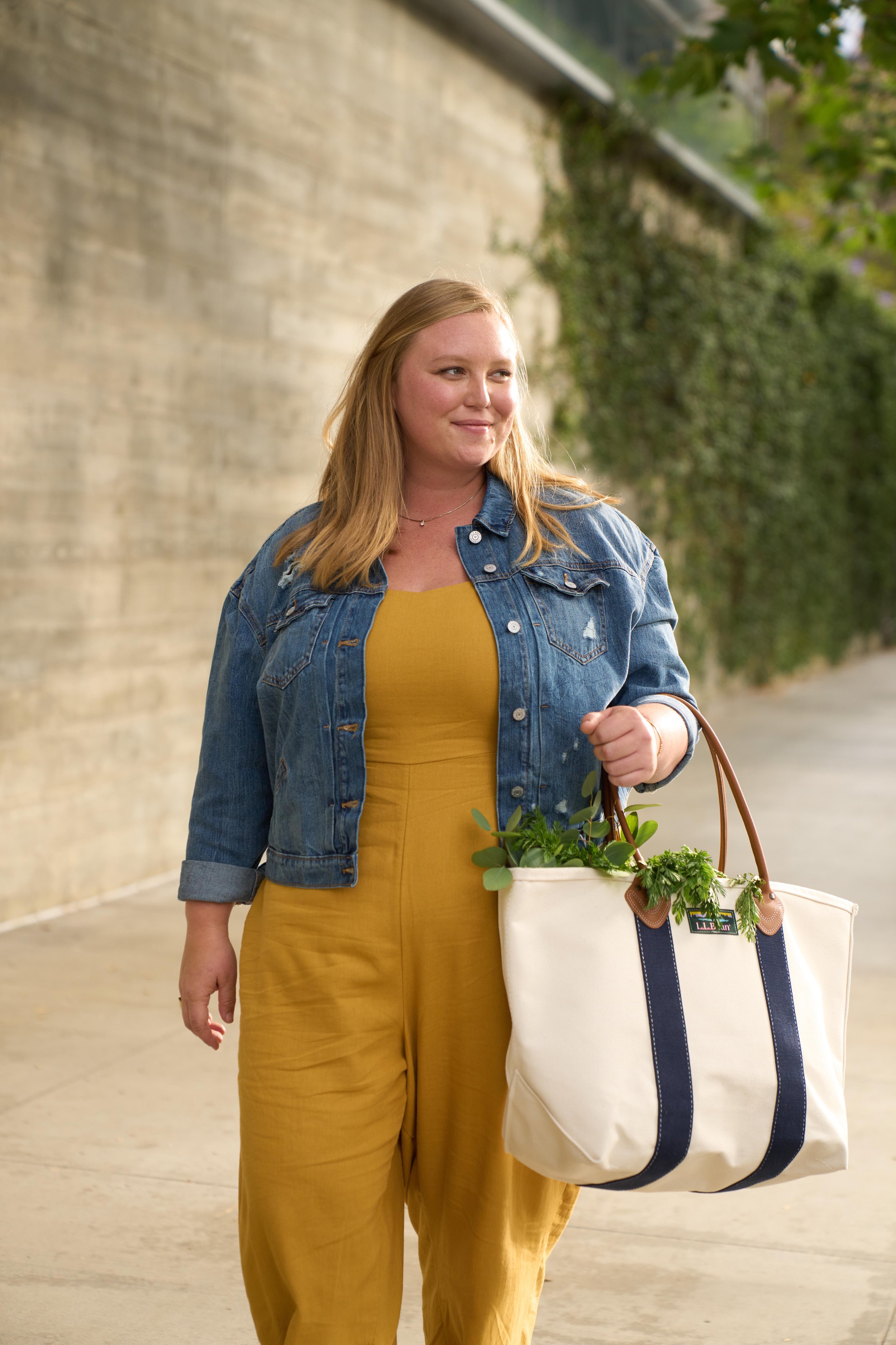
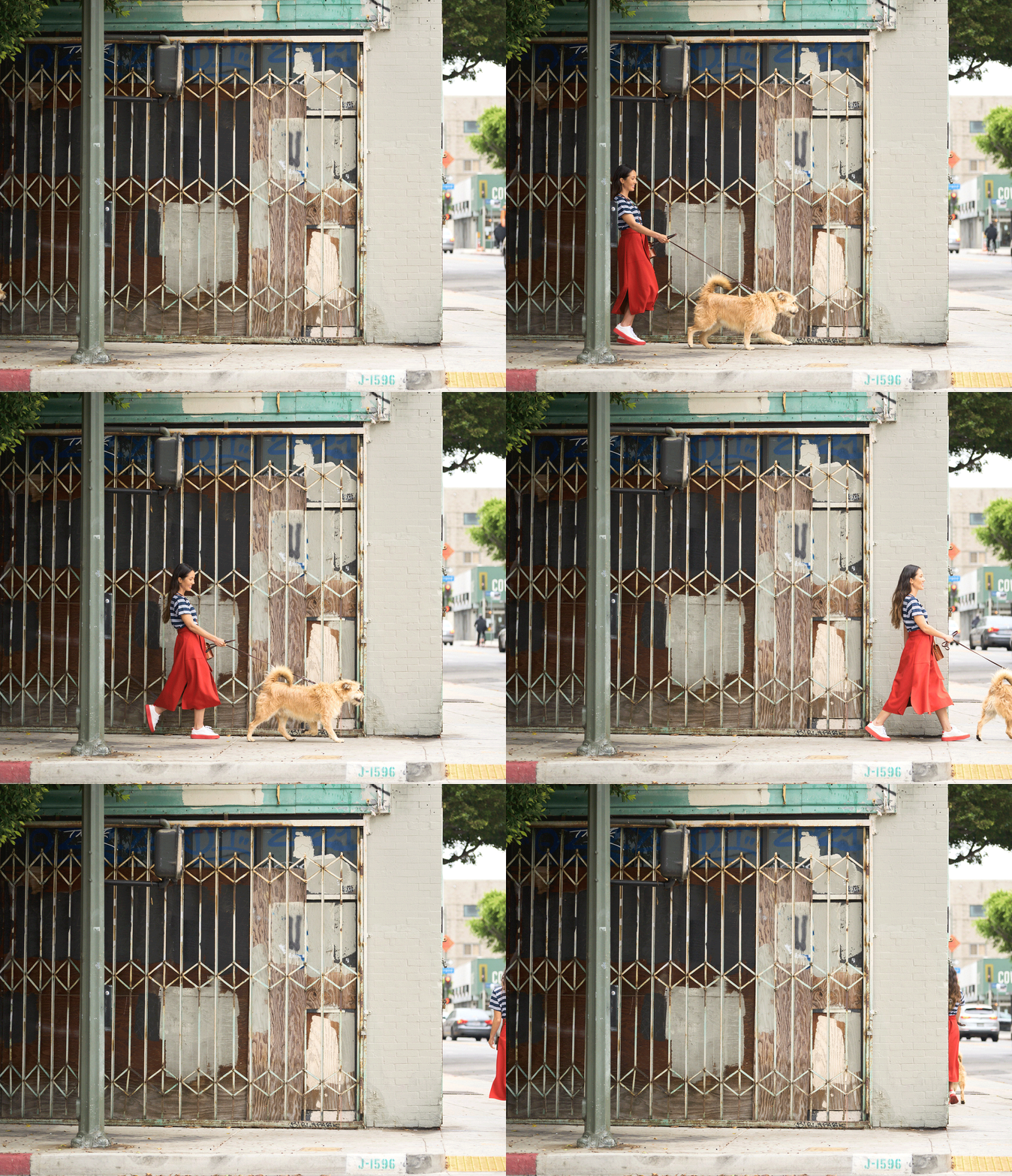
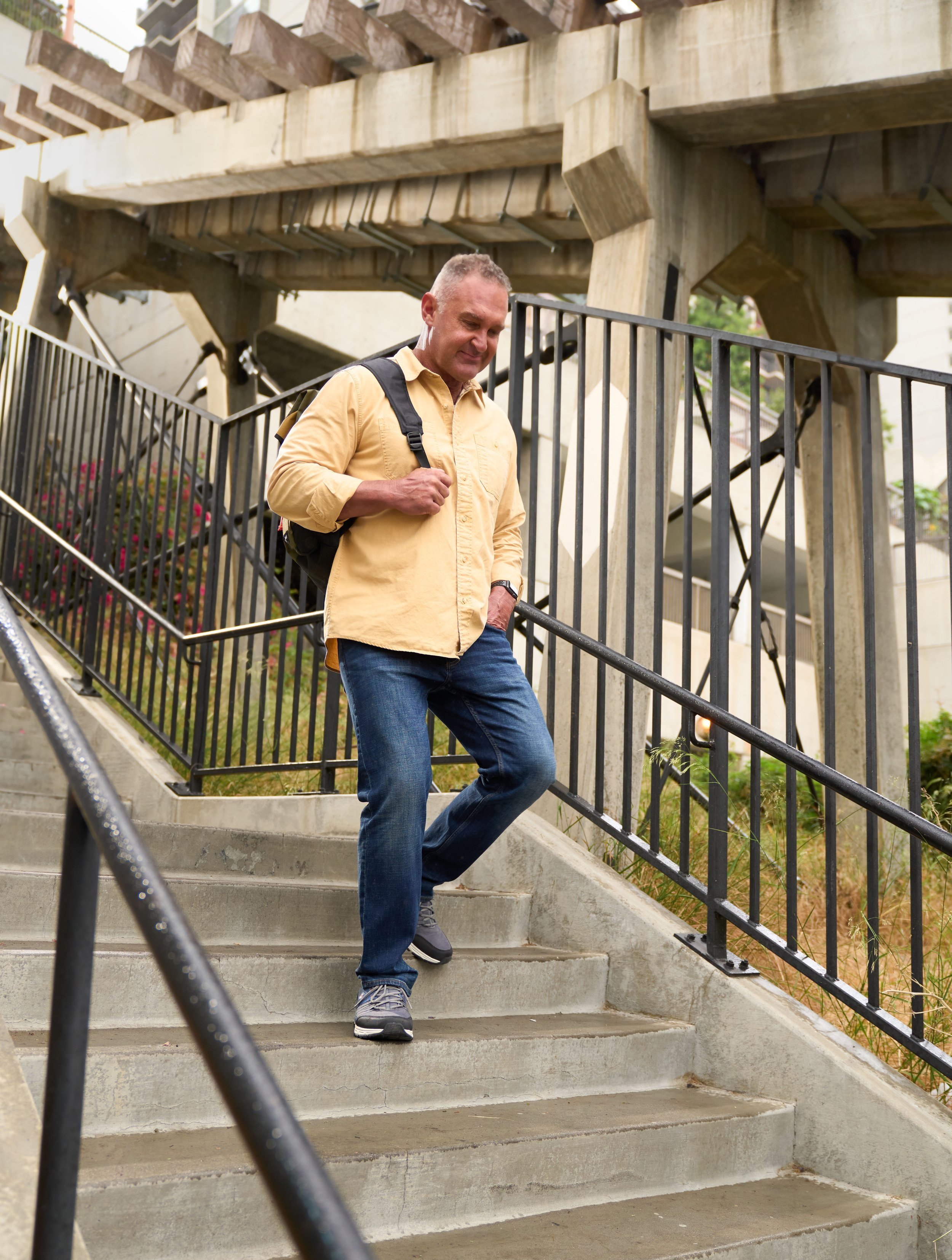
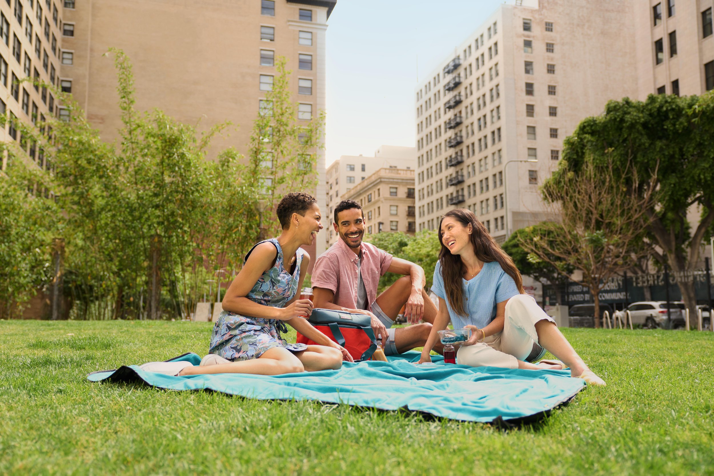
Enter our disruptive "Be An Outsider in the City" campaign. Rather than focusing on the traditionally “outdoorsy” types, we zoomed out to focus on urban inclusivity. We captured a library of content for web and social to break through the expected green spaces one typically sees featured on L.L.Bean and instead celebrated people getting outside in the city.
OUT OF HOME —
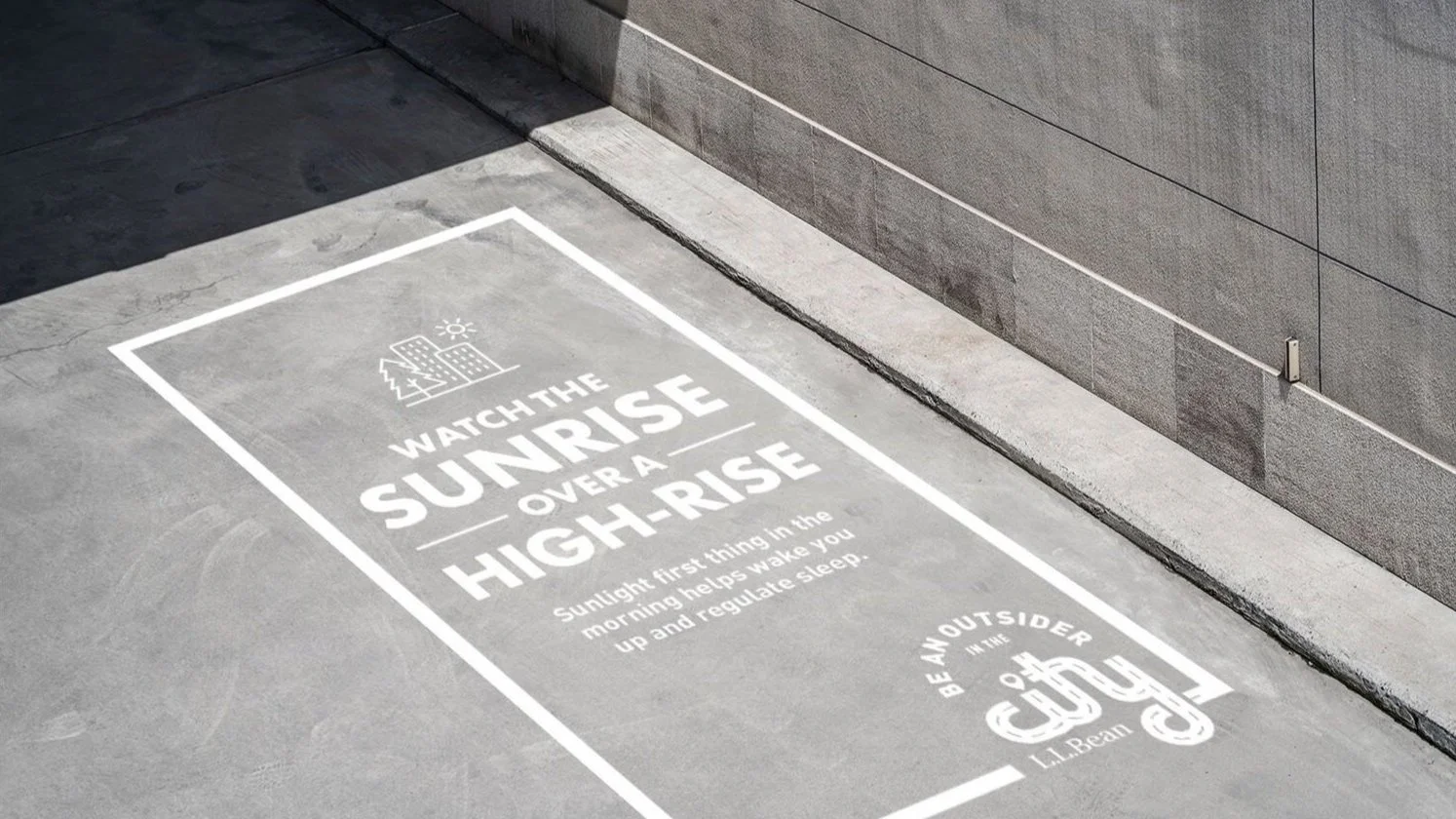
While the L.L.Bean catalog is full of scenic vistas and rustic landscapes, the majority of Americans’ day-to-day reality is more concrete jungle than canopied forest. So we met them where they are.
Throughout the campaign, L.L.Bean did not push any single line or product. Instead, we uplifted the sort of behavior that improves mental and physical health, building good will and creating a new strategic focus. And while we celebrated city-dwellers’ every step, we ourselves left no footprint. These guerilla techniques were incredibly low waste, as exemplified here by “clean graffiti” made with only pressurized water.
DESIGN APPROACH —
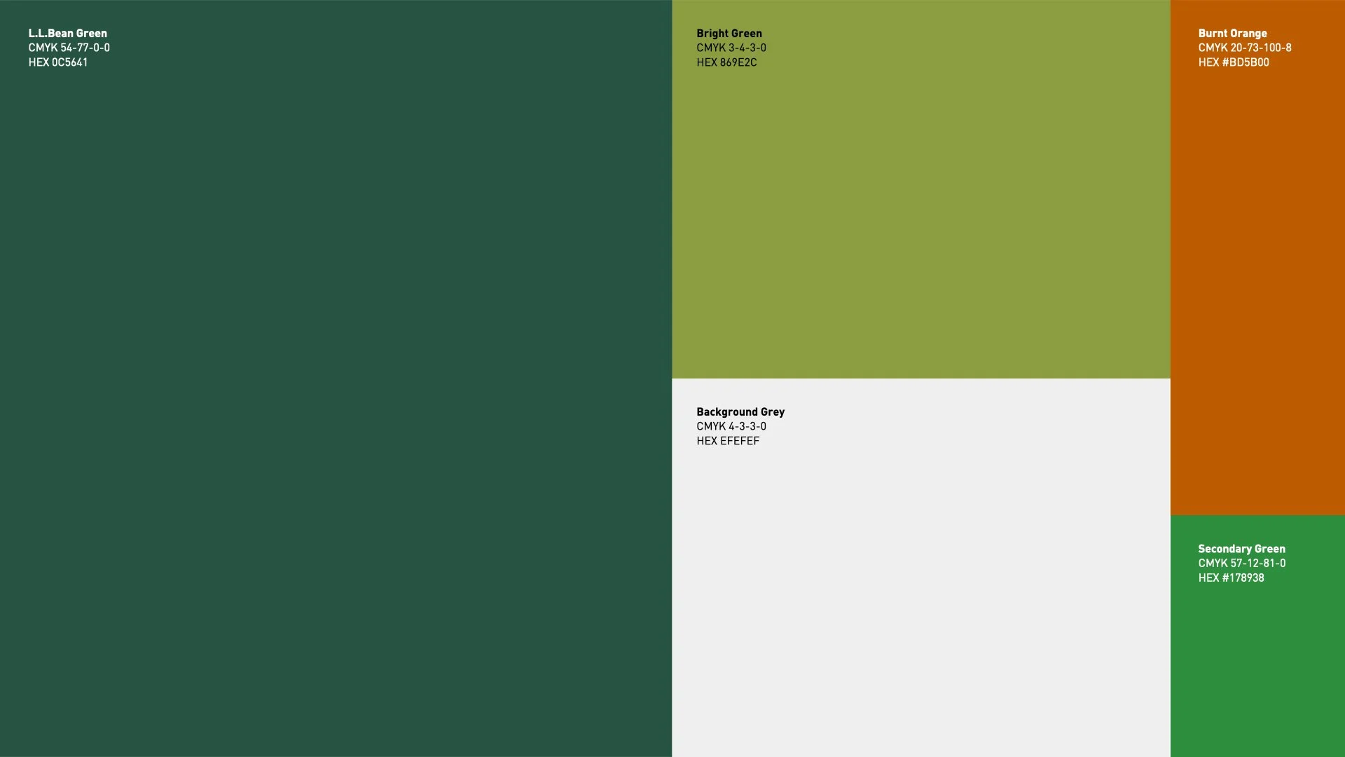
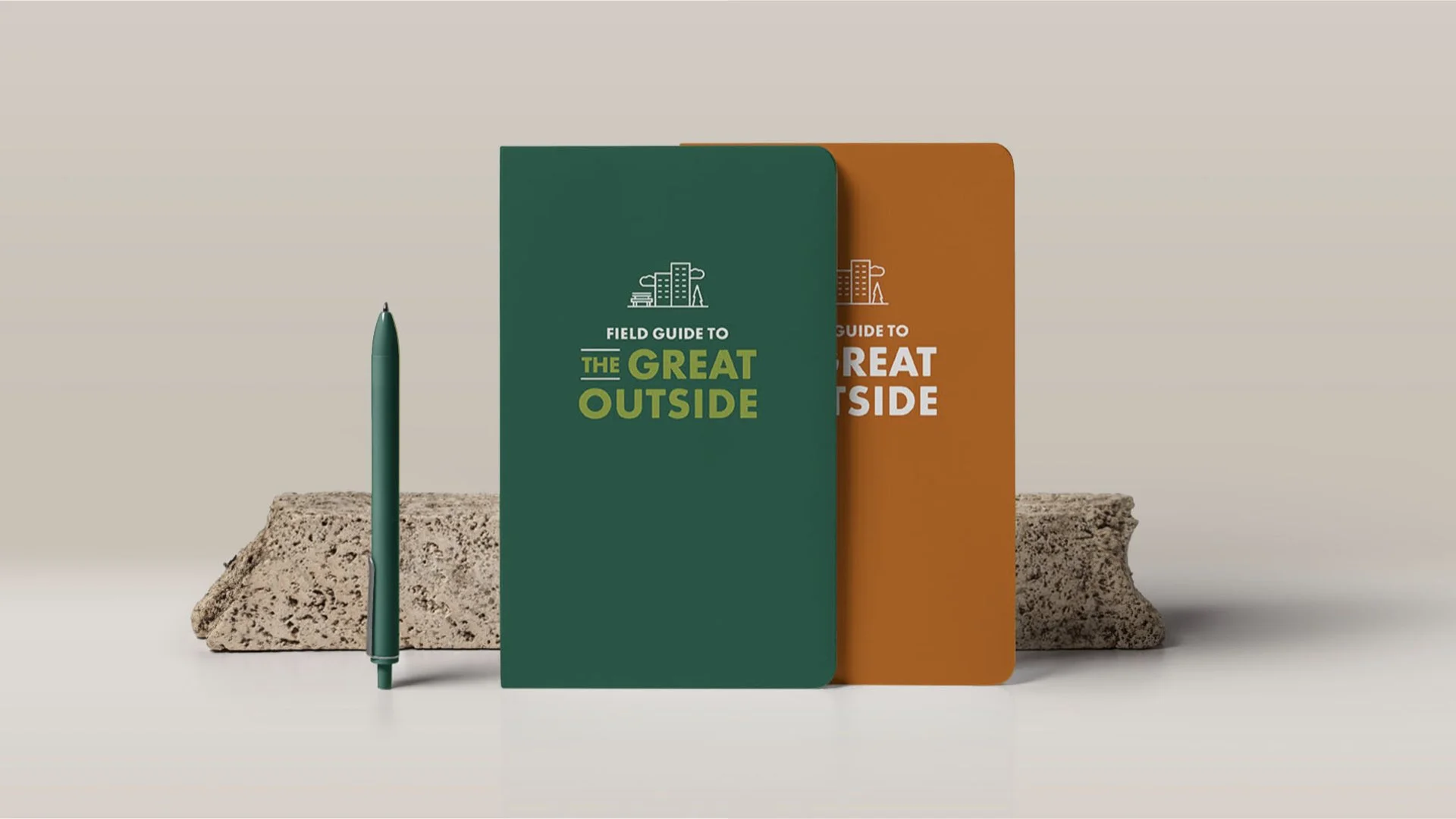
The look of the campaign is based on a classic field guide design, allowing the creative to act as your “guide” to getting outside in the city. We created tension using icons that speak to city activities, rather than those you would normally see in a field guide such as hiking or camping in hopes to redefine the “outdoors.”
WEB + SOCIAL CONTENT —
Not only did we capture a library of photography for social content, we also wrote a series of blog posts to help inspire city dwellers to get outside more.
My Role: Art Director/Designer
__
Copywriter: Katie Stone
Associate Design Director: Mallory Hern
Photographer: Natalie faye
Agency: Doner LA

